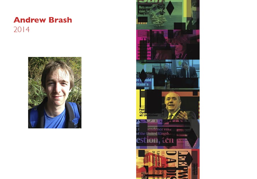
Andrew Brash 2014
If I was to receive the Award I would use it to continue my research project on contemporary iconography in Scotland. The award would allow for me to make 1–2 field research visits over the coming months and pay writing fees for a number of texts and interviews by journalists and writers related to the project (these were unable to happen before due to my budget). The fund would also allow me to continue the small-scale production of objects and designs for the project, and also print a small run of a forthcoming project publication of my research, texts and interviews, and my design outcomes.
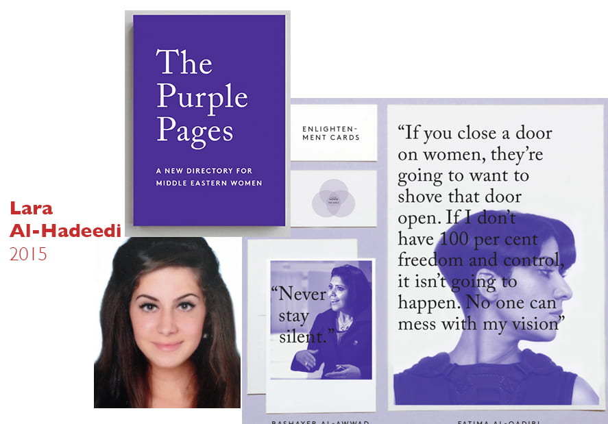
Lara Al-Hadeedi 2015
My aim is to start a campaign to promote progressive Gulf Arab women. Young girls need more role models who aren’t passive, concept of sharing insight.
Spotlight pioneering women in different fields.
This can become a trend that can shift a societal view of Middle Eastern women.
Reveal women as real and relatable.
Leen Charafeddine 2016
In an attempt to think about perpetuating children’s natural instinct towards discovery —as opposed to the prevalent sequestering of it—in math and science education, I would like to build what in my head I refer to as an “Interactive-Spatial-Digital-Mechanical-Rube-Goldberg-Geometry-Machine.” What it describes is a machine that draws geometry in a chain reaction caused by its parts. It is animated in parts, physical in others, and entirely child-driven. Children will have to work collaboratively and interact with different parts of the machine to draw a decagon having started with just a circle. Such a drawing is simple, yet its steps are numerous. The entire process will be an alternation between children drawing, using conductive ink, and the mechanics of the machine. The children will draw parts, which will activate the machine—mechanized with Arduino—to draw other parts, which in turn trigger other animated parts, bringing the turn back to the kids, etc. With this project, I hope to highlight several relationships: the relationship between the square and the decagon inscribed in it: the process at which one arrives at one shape from another. The next relationship is the one between all the different mechanical parts of the machine. Then there is the relationship between the math of mechanics, the math of computer science, and the math of geometry.
Woongroo Youn 2017
Socially Engaged Design New Malden is a suburb of South West London, and home to Europe’s most thriving Korean expatriate community. 700 North Korean defectors contribute to New Malden’s Korean community consisting of 2000 people. This is the largest number of North Korean expats in one place in the world. Furthermore, New Malden is the only place in the world where three nationalities; South Korean, North Korean and Korean Chinese live in harmony as immigrants.
Wall and Dust: The Story of New Malden aims to redefine the meaning of ‘home’ through the lives and stories of people who have left their homes and are now living in a microcosm of Korea in Europe. I hope this will be an opportunity to gain new perspectives on transnationalism and life as immigrants.
Pamela Dimitrov 2018
(Jointly with Zea Lindstrom)

Weaved and intertwined into everything I have done as a visual communicator is the fascination of my country, Thailand. The curiosities and questions that I have asked and explored through the many projects ever since high school up into my BA years have traversed around shedding light to Thailand’s beautiful, but antiquated and invisible, roots and conventions that have sculpted the character of the country today. Through the world’s eyes, Thailand remains as one of the top choices for enchanting summer holidays, while it’s captivating cultures lay alluring and attractive for visitors to rummage. As good as it sounds, I am afraid we, as a country, are plummeting
into a serious problem I describe as ‘the gap.’ The archaic but unique cultures and values of Thailand are falling between the gaps of adoption, where the current generation of Thais fail to appreciate their very own charisma, as evidenced by the ripples of replacements of many foreign cultures and influences in the ways of doing, seeing, and living of Thais. The distinct and authentic Thai image and characteristics remain a vestige that gets tucked away into the corner of the country, untouched and unincorporated into Thai’s contemporary ways, only revealing
itself to excited foreigners. The gap has initiated one my life’s journeys and goals; through visual communications, I aim to explore this vicinity, introduce conversations and dialogues around the dilemmas, and produce adventures that exist in and ultimately bridges this vast adoption gap.
Report
Thai-thai is a project aiming to contain many series that pick and pulls out the stories of Thailand’s art, culture, and hidden values, both from the courses of Thai history and modern Thailand. And with this great opportunity given by the Varley Memorial Award, the grant was used to run the first series of thai-thai which explores Thailand through objects and matters that occupy physical space. The dilemma here solidified at my encountering with the materials and objects that were produced by Thai locals to help them lead their daily life routines. The essence I revealed in this series cannot be described in one word but can only be demonstrated through my experience of seeing such profound and honest art of living. Such as the construction of chairs that were built from assembling unused scraps or objects in a local’s home, was to them, an act of surviving, but to me, a total creative reinvention of a structure that holds weight and prevents the discomfort arriving from meat and bones resting on the hard floor. I aim for thai-thai to reveal this essence that is now woven into a story of heritage and the act of passing on the wisdom that was not created to sell or to allure people into but to be passed on from the previous Thai to the next Thai. People must realize, even if it is not prominent, that these acts are only one example of a string of values shared by the Thai people. Thai-thai intends to become a project that starts today and remain on-going and aims to begin a course of discussions that bring other people from the art and design, and the general public, to realize and perhaps join in, what is like a living platform or a movement even.
Zea Lindstrom 2018
(Jointly with Pamela Dimitrov)
To what extent can an image push the human form? To show a more vulnerable and a rawer side of what we have never seen before? Revealing different shapes and forms of people that don’t fit the ideal of how we think a body should look like. Creating a space where there is room for people to express themselves and be vulnerable without being judge by the outside. Can we push the physical limits and liberate the individual from society’s view by creating a powerful image of what the actual body looks like?
One may say that human bodies are majestic and beautiful, from the internal intrinsic workings to the external skin and hair that constitutes flesh, the biological wonders of our bodies. We often neglect them and punish our bodies for not fitting an idealized archetype or digitally enhanced version of the human form. Where we label ourselves as being “imperfect”, a recursion of punishment that impact our self-confidence and self-esteem. We live in a society where this pattern reoccurs constantly in different forms of media and in our daily lives.
In December 2017 I started working on a project called “The Bodies We Wear”.
The project took the form of an interactive installation: a piece created by cutting up large scale photographs of myself naked and placing it in a sterile ‘butcher market’ environment. The butcher market was a symbol of how society’s view and outspoken opinions becomes a slaughter on one’s self-image and how one does not fit the idolized archetype. This project was a response of my own anxieties and struggles of being obese for over 10 years. The fear of not being accepted and loved. That my body was different from the standardized and publicized forms of beauty. It was about revealing a big part of my life, showing its own human form and its rawness. Showing a hidden physical form, that needs to take its own place in this society and have its own voice. This is about people who don’t fit the criteria of body ideals, who don’t feel they have a place, that needs to be heard and become memorable.
Report
Meat District: is a photography project that approaches the issue of the beauty industry, where the pressure to conform to beauty standards has reached a point where Facetune and instagram filters routinely function as templates for a skyrocketing number of aesthetic procedures. The project is a response of my own anxieties and struggles of body dysmorphia, where I always felt the pressure to constantly change my appearance and my body in order to be accepted and loved. That my body was different from the standardized and publicized forms of beauty. Have you installed the latest upgrade
Emily Schofield 2019
Do objects have feelings? Do they communicate with each other? Do they look at us humans in frustration, judgement or, perhaps, amusement?
Does the radiator want to be used for heat? Does the mug want to hold tea or coffee? Do they want to decide for themselves?
Much of my current research deals with the the Human- Object relationship: how do we value the things we buy and use and come in contact with every day? How removed are we from the human hands that built it? How removed are we from physical matter, in general?
We create objects, we name them, we sell them and we buy them. This makes us believe we hold powers over the world of inanimate matter. However, our consumerist habits make it clear we are completely enchanted with these objects. Perhaps we need to acknowledge a less anthro- pocentric worldview in which we allow for the belief that the world of things may be more alive than we think.
Earlier this year I began working on a project entitled
Eponym:. The aim of the project was to disrupt the hierarchical relationship between object and subject by allowing objects to spell themselves out typographically. In doing so, the act of self-naming would give the object agency and elevate its subjectivity.
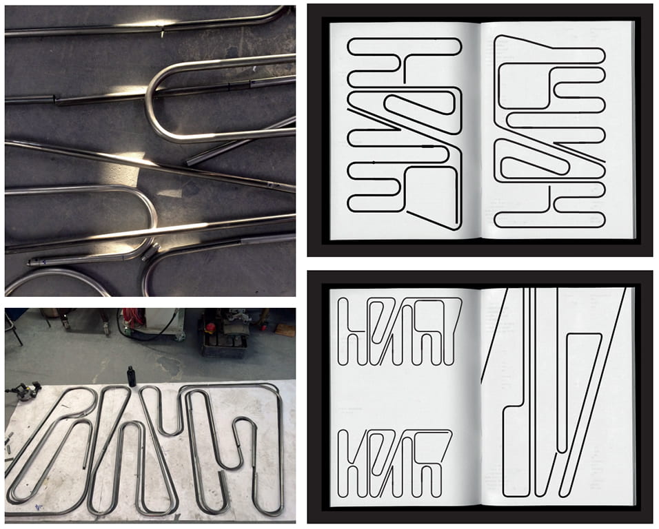
The project is intended for a series of functional objects and my first outcome was Eponym: Radiator. My process was to pick a commodity and examine, firstly, its form and relation to functionality. In the case of the radiator, it’s metal tubes which carry heat in form of water and steam in long vertical folds. I then ran the letters RADIATOR through a series of abstractions to make it respond to a set of rules in relation to the radiator shape. The rules were designed to simultaneously fit the logic of the object’s shape and disrupt it. Finally, I built my design out of metal tubes to create a 1,2×2 m big object. The radiator, in spelling out its own name typographically, rendered its functionality useless. The tubes would no longer be able to carry heat effectively through its now distorted shape.
Other use objects I intend to include in the series are a ladder and a tote bag. In the case of the ladder, for example, I would design my letters to adhere to the functional form of the ladder: two vertical strokes with various horizontal strokes in the middle. By morphing the horizontals into diagonals, the ladder would defeat its own purpose — no one would be able to climb it and the ladder becomes an entirely different object altogether.
The Eponym: project merges my background in typography and type design and interest in sculptural work with philosophical ideas responding to the state of the world we live in. A radical new thinking with regards to how we see and treat inanimate matter is needed and at the foundation of this lies a critical and creative immersion with the human-object-relationship. Parallel to this I am
interested in opening up the field of visual communication to draw upon wider theories, ideas, crafts, mediums and forms but with an anchor in graphic design. When I showed Eponym: Radiator at the Typographic Singularity exhibition earlier this year, I was pleased to see how visitors from outside the field of visual communication responded to seeing projects which sit within typography but expand onto physical forms.
Financial support would be used for materials and technical support (about a quarter of the budget). I would, further- more, bring the project back into a graphic design context by creating a publication detailing the thinking, process and outcome of the project alongside a reader of relevant writing and theory and comissioned pieces of writing by students from the MA Creative Writing course (about half of the budget). I would then use the remaining budget to organise a small symposium or talk relating to the idea of lively matter/the lives of objects and how a more abstract, philosophical, playful and fantastical thinking can change the way we consume and create. My hope would be for the publication and potential talk to open this project up to a wider audience and make its contents more accessible and comprehensible. The resulting conversation from the publication and symposium should turn towards speculations, ideas and solutions for the way we engage with commerce, consumerism and materiality.
Report (delayed by College closure [Covid19])
Since receiving the Varley Award I have designed plans for further objects in the Eponym series. Eponym: Bag, Tray, Ladder and Table are currently work in progress. Prior to the Covid-19 outbreak and subsequent shutting down of College I had been focused on creating a prototype for Eponym: Tray. Its design is a translation between a classic canteen tray with several food compartments and the negative space found forming between the letters T-R-A-Y. A template was created from several laser cut pieces of wood which I used to create a vacuum formed shape out of High Impact Polystyrene. I am currently focused on creating the Eponym publication and detailed plans for further objects. The outbreak of Covid-19 has prompted a fundamental dilemma in the progress of this project. Though by nature a speculative project, Eponym was never intended to become an archive of digital drawings or renders. At the heart of its subject lies an engagement with physical matter and I intend to continue producing the objects in this series in their physical form. The lack of technical workshops and support has resulted in a hiatus, but I am hopeful new Eponyms will find their typographic autonomy very soon.
https://emilyschofield
Ricky Stoch 2019
In 2015 the United Nations member states adopted the 2030 Agenda for Sustainable Development. The agenda outlines 17 Sustainable Development Goals (SDGs) that are a call to action for all countries ( developed and developing) toward ending poverty, improving health care, education, reducing inequality, tackling climate change and stimulating economic growth.
I am proposing a project that addresses UN SDG 3, Health and Wellbeing. Specifically, I am interested in using visual communication to tackle the target 3.3: “By 2030, end the epidemics of AIDS, tuberculosis, malaria and neglected tropical diseases and combat hepatitis, water-borne diseases and other communicable diseases.”
In light of this, my research looks at developing a sticker that can be added to medication packaging with the goal of increasing adherence to Anti Retro Virials (ARVs) and TB treatment. This is specifically designed to address adherence in the developing world. The design is based in behavioural economics theory and how visual communication can be utilised to achieve behavioural change. If successful this project has the potential to make a tangible difference in the management of both HIV/AIDS and TB. This is because incorrect adherence to medication can result in resistance by the HIV/AIDS virus and TB bacteria to medication which makes treatment and control significantly more challenging.
My hope is that with adequate funding and support I will be able to take this research into my second year at RCA and ultimately find ways of adapting the current design for varied treatment protocols to different diseases.
I would use the £2000.00 prize money for the following:
– £1200.00 – prototyping (each prototype run costs £200.00). With £1200.00 I would have the opportunity to produce 6 prototypes for testing and presenting to potential partner organisations.
– £800.00 – return flight to South Africa to meet with potential partner organisations to propose running pilot studies to test the viability of the design. Potential companies/organisations including Discovery Health, Genesis Analytics and the Centre for Disease Control.
Report
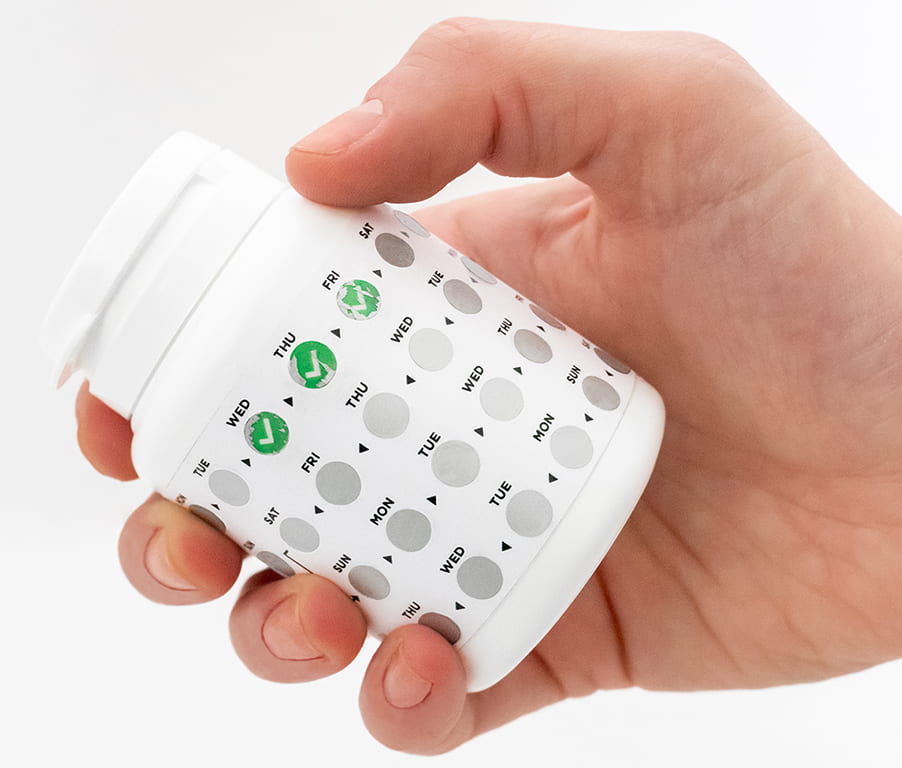
There are approximately 37 million people living with HIV-AIDS globally. One of the prohibitive factors to eradicating the disease is poor adherence to antiretrovirals (ARVs). Forgetfulness is a major reason HIV+ patients do not adhere to their treatment. It is difficult to remember to take medication daily, especially when a condition requires lifelong treatment. Key to managing the disease is finding simple, cost-effective and innovative approaches to increasing treatment adherence.
FebriSol is a sticker that, when added to ARV packaging, uses behavioural economic theory to nudge patients to remember to take their medication. Each day, patients take their pills, scratch off the day’s metallic coating and receive positive reinforcement when a ‘tick’ is revealed, indicating that day’s medication has been taken. In addition to providing positive reinforcement, patients are also able to see, at a glance, whether or not they have taken their medication on any given day. The sticker can also be applied to other daily medications such as those used to treat tuberculosis, hypertension, diabetes, depression and many more chronic conditions.
Since winning the Varley award, the design of the sticker has been refined and prototypes of both the sticker and packaging have been developed. I have been in consultation with key stakeholders in HIV/AIDS research and hope to move forward with the University of Witwatersrand Reproductive Health Institute on a viability trial. Unfortunately due to Covid-19 this has been put on hold but discussions will hopefully proceed after the crisis.

Update: Recently the first official production run of FebriSol was delivered to Cipla’s headquarters in Cape Town. They will be running a pilot, which if successful should lead to national implementation. They are the biggest producer of generic pharmaceuticals in South Africa and also hold the government tender for antiretroviral provision in the public system.
I wanted to say thank you! I used all the award money to fund the majority of the R&D of the stickers. It really helped kickstart what I hope will one make a huge impact in the lives of HIV+ patients and those on chronic medication.
None of this would have been possible without the Varley Award.
https://rickystoch.com/