9 User Study for Journey and Time Perception

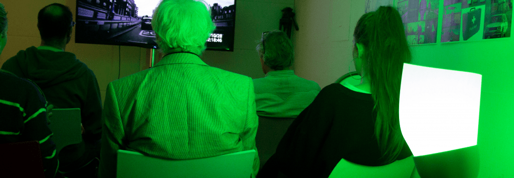
Participants during the immersive driving experience.
Driving Whisper
We conducted three consecutive user engagement workshops after gathering public feedback on the concepts demonstrated through the videos and interactive displays that we exhibited at the London Design Festival 2018. This was to allow us to conduct research into people’s driving related rituals and user test the prototypes we had made.
When making a long trip, new participants described a range of emotions they had previously experienced in such situations. These included positive feelings – curiosity, anticipation and excitement – as well as negative feelings – apprehension, stress, anxiety, tiredness and annoyance. They said they used indicators such as natural light, route information on apps, maps or signposts as well as their own signals of physical or mental tiredness to keep a sense of and to track time when driving.
We showed the participants our animated video (previously mentioned as Driving Whisper showing a proposed lighting interface to represent monitoring progress on a journey. The participants were then asked to choose from a selection of generic graphic shapes (inspired by common interface progress indicators), the ones that they felt were the most logical and could be easily understood as showing time in relation to a journey. The overall preferences were for a circular display with clockwise movement, a long horizontal display with movement from left to right or a map-like interface also moving from left to right. There was a distinct tendency for people to split up their journey visualisations into five parts, always marking out a midway point.
Participants creating their preferred time and progress indicator displays.
We then gave them an immersive driving experience in a room we illuminated with different colours of light each lasting for three minutes. Concurrently, we were also playing a video on a large screen showing the view through the windscreen of a car driving, with audio and a steering wheel prop, which they were each holding. They were asked to record their emotions after each coloured light had been tested, which were red, green, white, blue and yellow.
Participants experiencing and testing colour immersion.
From the feedback we
Previous Chapter
Next Chapter
